Assessing Credit Score Prediction Reliability Using Bootstrap Resampling
R
Credit Risk Analytics
Bootstrapping
Published
November 15, 2024
Credit scoring models tend to perform well in the middle of the score distribution — but reliability drops at the extremes, where data thins out. In this post, let’s use bootstrap resampling to measure how much predictions vary across score ranges and pinpoint where a model can and can’t be fully trusted.
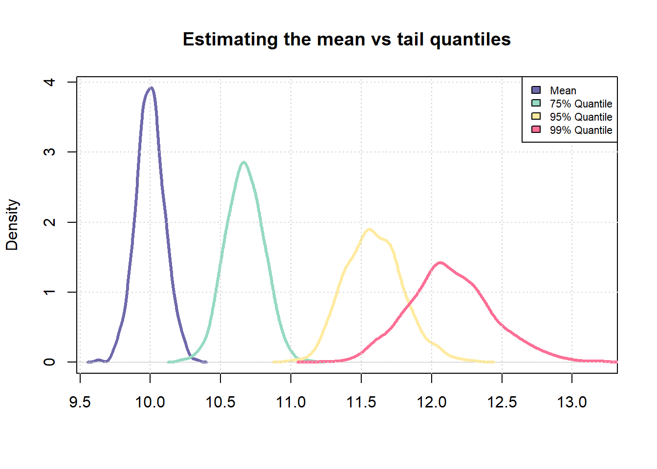
Smaller sample sizes mean more variance in statistical estimates — especially for extreme values. Central measures like the mean stay relatively stable even with limited data, but tail percentiles (95th, 99th) can swing considerably. In credit scoring, this matters because the highest and lowest scores are precisely the ones living in those unstable tails.
# Number of samples to be drawn from a probability distributionn_samples <-1000# Number of times, sampling should be repeatedrepeats <-100# Mean and std-dev for a standard normal distributionmu <-5std_dev <-2# Samplesamples <-rnorm(n_samples * repeats, mean =10)# Fit into a matrix like object with `n_samples' number of rows # and `repeats' number of columnssamples <-matrix(samples, nrow = n_samples, ncol = repeats)# Compute mean across each columnsample_means <-apply(samples, 1, mean)# Similarly, compute 75% and 95% quantile across each columnsample_75_quantile <-apply(samples, 1, quantile, p =0.75)sample_95_quantile <-apply(samples, 1, quantile, p =0.95)sample_99_quantile <-apply(samples, 1, quantile, p =0.99)# Compare coefficient of variationsd(sample_means)/mean(sample_means)
[1] 0.01020788
sd(sample_75_quantile)/mean(sample_75_quantile)
[1] 0.01266596
sd(sample_95_quantile)/mean(sample_75_quantile)
[1] 0.01939092
# Plot the distributionscombined_vec <-c(sample_means, sample_75_quantile, sample_95_quantile, sample_99_quantile)plot(density(sample_means), col ="#6F69AC", lwd =3, main ="Estimating the mean vs tail quantiles", xlab ="", xlim =c(min(combined_vec), max(combined_vec)))lines(density(sample_75_quantile), col ="#95DAC1", lwd =3)lines(density(sample_95_quantile), col ="#FFEBA1", lwd =3)lines(density(sample_99_quantile), col ="#FD6F96", lwd =3)grid()legend("topright", fill =c("#6F69AC", "#95DAC1", "#FFEBA1", "#FD6F96"), legend =c("Mean", "75% Quantile", "95% Quantile", "99% Quantile"), cex =0.7)
The chart makes the point clearly — the mean distribution (purple) is much tighter than the 99th percentile (pink). The same principle applies in credit scoring: scores at the extremes carry more uncertainty, almost by definition.
In this post, let’s use a sample from the Lending Club dataset. Loans classified as “Charged Off” are treated as defaults. The class imbalance here is typical of real credit portfolios and is a key reason predictions become less reliable at the score extremes.
# Load sample data (sample of the lending club data)sample <-read.csv("http://bit.ly/42ypcnJ")# Mark which loan status will be tagged as defaultcodes <-c("Charged Off", "Does not meet the credit policy. Status:Charged Off")# Apply above codes and create targetsample %<>%mutate(bad_flag =ifelse(loan_status %in% codes, 1, 0))# Replace missing values with a default valuesample[is.na(sample)] <--1# Get summary tallytable(sample$bad_flag)
   0    1
8838 1162
Implementing Bootstrap Resampling Strategy
Let’s create 100 bootstrap samples to measure how much model predictions vary across score ranges. Bootstrap resampling generates multiple simulated datasets from the original data, so we can quantify prediction uncertainty without collecting any additional observations.
# Create 100 samplesboot_sample <-bootstraps(data = sample, times =100)head(boot_sample, 3)
Each bootstrap sample consists of random draws with replacement from the original dataset, creating controlled variations that effectively reveal model sensitivity to different data compositions.
Developing the Predictive Model Framework
This post uses logistic regression — the industry standard for credit risk modeling, valued for its interpretability and regulatory acceptance. The model includes typical credit variables: loan amount, income, and credit history metrics.
glm_model <-function(df){# Fit a simple model with a set specification mdl <-glm(bad_flag ~ loan_amnt + funded_amnt + annual_inc + delinq_2yrs + inq_last_6mths + mths_since_last_delinq + fico_range_low + mths_since_last_record + revol_util + total_pymnt,family ="binomial",data = df)# Return fitted valuesreturn(predict(mdl))}# Test the function# Retrieve a data frametrain <-analysis(boot_sample$splits[[1]])# Predictpred <-glm_model(train)# Check outputrange(pred) # Output is on log odds scale
[1] -27.884057 1.082999
The function returns predictions in log-odds format, which will subsequently be transformed to a more intuitive credit score scale in later steps.
Iterative Model Training and Prediction Collection
# First apply the glm fitting function to each of the sample# Note the use of lapplyoutput <-lapply(boot_sample$splits, function(x){ train <-analysis(x) pred <-glm_model(train)return(pred)})# Collate all predictions into a vector boot_preds <-do.call(c, output)range(boot_preds)
[1] -132.89625 3.16478
# Get outliersq_high <-quantile(boot_preds, 0.99)q_low <-quantile(boot_preds, 0.01)# Truncate the overall distribution to within the lower 1% and upper 1% quantiles# Doing this since it creates issues later on when scaling the outputboot_preds[boot_preds > q_high] <- q_highboot_preds[boot_preds < q_low] <- q_lowrange(boot_preds)
[1] -5.0670232 -0.2304028
# Convert to a data frameboot_preds <-data.frame(pred = boot_preds, id =rep(1:length(boot_sample$splits), each =nrow(sample)))head(boot_preds)
       pred id
1 -1.415344  1
2 -2.363616  1
3 -1.758686  1
4 -2.551845  1
5 -4.488183  1
6 -1.690804  1
Here, let’s apply the logistic regression model to each bootstrap sample and collect the resulting predictions. Extreme values beyond the 1st and 99th percentiles are then truncated to remove outliers — the same capping approach used in production credit models.
Transforming Predictions to Credit Score Scale
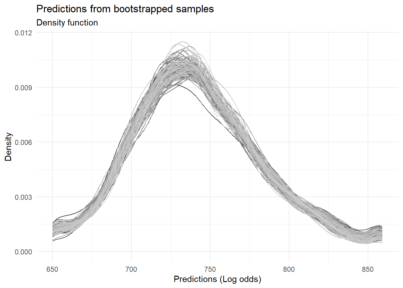
Let’s convert the log-odds predictions into a familiar credit score format using the industry-standard Points to Double Odds (PDO) methodology. With parameters typical of real-world credit systems (PDO=30, Anchor=700), scores are scaled so that higher values indicate lower credit risk.
scaling_func <-function(vec, PDO =30, OddsAtAnchor =5, Anchor =700){ beta <- PDO /log(2) alpha <- Anchor - PDO * OddsAtAnchor# Simple linear scaling of the log odds scr <- alpha - beta * vec # Round offreturn(round(scr, 0))}boot_preds$scores <-scaling_func(boot_preds$pred, 30, 2, 700)# Chart the distribution of predictions across all the samplesggplot(boot_preds, aes(x = scores, color =factor(id))) +geom_density() +theme_minimal() +theme(legend.position ="none") +scale_color_grey() +labs(title ="Predictions from bootstrapped samples", subtitle ="Density function", x ="Predictions (Log odds)", y ="Density")
Quantifying Prediction Uncertainty Across Score Ranges
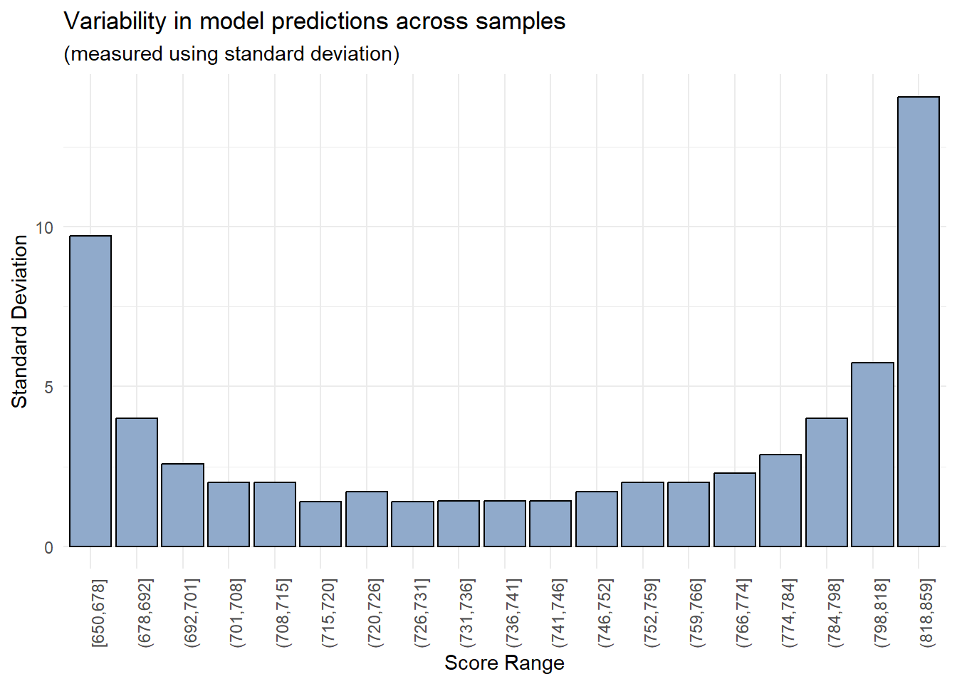
Let’s measure prediction reliability directly by calculating the standard deviation of scores within each bin — a straightforward way to see where the model is stable and where it isn’t.
# Create bins using quantilesbreaks <-quantile(boot_preds$scores, probs =seq(0, 1, length.out =20))boot_preds$bins <-cut(boot_preds$scores, breaks =unique(breaks), include.lowest = T, right = T)# Chart standard deviation of model predictions across each score binboot_preds %>%group_by(bins) %>%summarise(std_dev =sd(scores)) %>%ggplot(aes(x = bins, y = std_dev)) +geom_col(color ="black", fill ="#90AACB") +theme_minimal() +theme(axis.text.x =element_text(angle =90)) +theme(legend.position ="none") +labs(title ="Variability in model predictions across samples", subtitle ="(measured using standard deviation)", x ="Score Range", y ="Standard Deviation")
As anticipated, the model’s predictions demonstrate enhanced reliability within a specific range of values (700-800), while exhibiting significant variability in the lowest and highest score buckets.
The visualization reveals a characteristic “U-shaped” pattern of prediction variability—a well-documented phenomenon in credit risk modeling. The highest uncertainty manifests in the extreme score ranges (very high and very low scores), while predictions in the middle range demonstrate greater stability. The analysis confirms the initial hypothesis: variability reaches its maximum at score extremes and achieves its minimum in the middle range (600-800). This finding provides direct guidance for credit policy development—scores in the middle range demonstrate the highest reliability, while decisions at the extremes should incorporate additional caution due to elevated uncertainty.
Practical Business Applications
These findings yield direct business applications:
High Score Management: For extremely high scores, implement additional verification steps before automated approval
Low Score Management: For very low scores, consider manual review procedures rather than automatic rejection
Advanced Methodology: Isolating Training Data Effects
Credit: Richard Warnung
For tighter analytical control, let’s try an alternative approach: train models on bootstrap samples, but evaluate them on a fixed validation set. This isolates the effect of training data variation on predictions.
Vs <-function(boot_split){# Train model on the bootstrapped data train <-analysis(boot_split)# Fit model mdl <-glm(bad_flag ~ loan_amnt + funded_amnt + annual_inc + delinq_2yrs + inq_last_6mths + mths_since_last_delinq + fico_range_low + mths_since_last_record + revol_util + total_pymnt,family ="binomial",data = train)# Apply to a common validation set validate_preds <-predict(mdl, newdata = validate_set)# Return predictionsreturn(validate_preds)}
This approach gives clearer insight into how training data variation affects predictions — particularly useful when evaluating model updates in production.
# Create overall training and testing datasets id <-sample(1:nrow(sample), size =nrow(sample)*0.8, replace = F)train_data <- sample[id,]test_data <- sample[-id,]# Bootstrapped samples are now pulled only from the overall training datasetboot_sample <-bootstraps(data = train_data, times =80)# Using the same function from before but predicting on the same test datasetglm_model <-function(train, test){ mdl <-glm(bad_flag ~ loan_amnt + funded_amnt + annual_inc + delinq_2yrs + inq_last_6mths + mths_since_last_delinq + fico_range_low + mths_since_last_record + revol_util + total_pymnt,family ="binomial",data = train)# Return fitted values on the test datasetreturn(predict(mdl, newdata = test))}# Apply the glm fitting function to each of the sample# But predict on the same test datasetoutput <-lapply(boot_sample$splits, function(x){ train <-analysis(x) pred <-glm_model(train, test_data)return(pred)})
Key Takeaways
Prediction reliability varies significantly across score ranges, with highest uncertainty at distribution extremes
Bootstrap methodology provides a practical framework for measuring model uncertainty without additional data requirements
Risk management strategies should be adjusted based on score reliability, with enhanced verification for extreme scores
The PDO transformation enables intuitive score interpretation while preserving the underlying risk relationships
These techniques can be applied beyond credit scoring to any prediction problem where understanding model uncertainty is critical for decision-making.