# Load required packages
library(dplyr)
library(ggplot2)
library(scales)
library(stringr)Developing Custom Charting Functions with ggplot2
R
Data Visualization
ggplot2
R has plenty of visualization options, but ggplot2 stands out for its flexibility, quality, and composability. In this post, let’s build reusable custom charting functions on top of ggplot2 — the kind you can drop straight into a production analytics workflow.
Required Packages
Dataset Acquisition and Preparation
Let’s use a summarized version of the COVID-19 Data Repository from Johns Hopkins University to build and test the custom charts.
# Load COVID-19 data
df <- read.csv("https://bit.ly/3G8G63u")

# Get top 5 countries by death count
top_countries <- df %>%
  group_by(country) %>%
  summarise(count = sum(deaths_daily)) %>%
  top_n(5) %>%
  .$country

print(top_countries)
[1] "Brazil" "India" "Mexico" "Russia" "US" Let’s calculate a 7-day centered moving average of daily confirmed cases for these five countries:
# Create a data frame with the required information
# Note that a centered 7-day moving average is used
plotdf <- df %>%
  mutate(date = as.Date(date, format = "%m/%d/%Y")) %>%
  filter(country %in% top_countries) %>%
  group_by(country, date) %>%
  summarise(count = sum(confirmed_daily)) %>%
  arrange(country, date) %>%
  group_by(country) %>%
  mutate(MA = zoo::rollapply(count, FUN = mean, width = 7, by = 1, fill = NA, align = "center"))
Fundamental Line Chart Function Development
The initial implementation demonstrates the creation of a basic line chart function. Note the utilization of aes_string() instead of aes(), which enables the provision of arguments to ggplot2 as string parameters, thereby enhancing function flexibility and programmability.
# Function definition
line_chart <- function(df,
                       x,
                       y,
                       group_color = NULL,
                       line_width = 1,
                       line_type = 1){

  ggplot(df, aes(x = !! sym(x),
                 y = !! sym(y),
                 color = !! sym(group_color))) +
    geom_line(linewidth = line_width,
              linetype = line_type)
}

# Test run
line_chart(plotdf,
           x = "date",
           y = "MA",
           group_color = "country",
           line_type = 1,
           line_width = 1.2)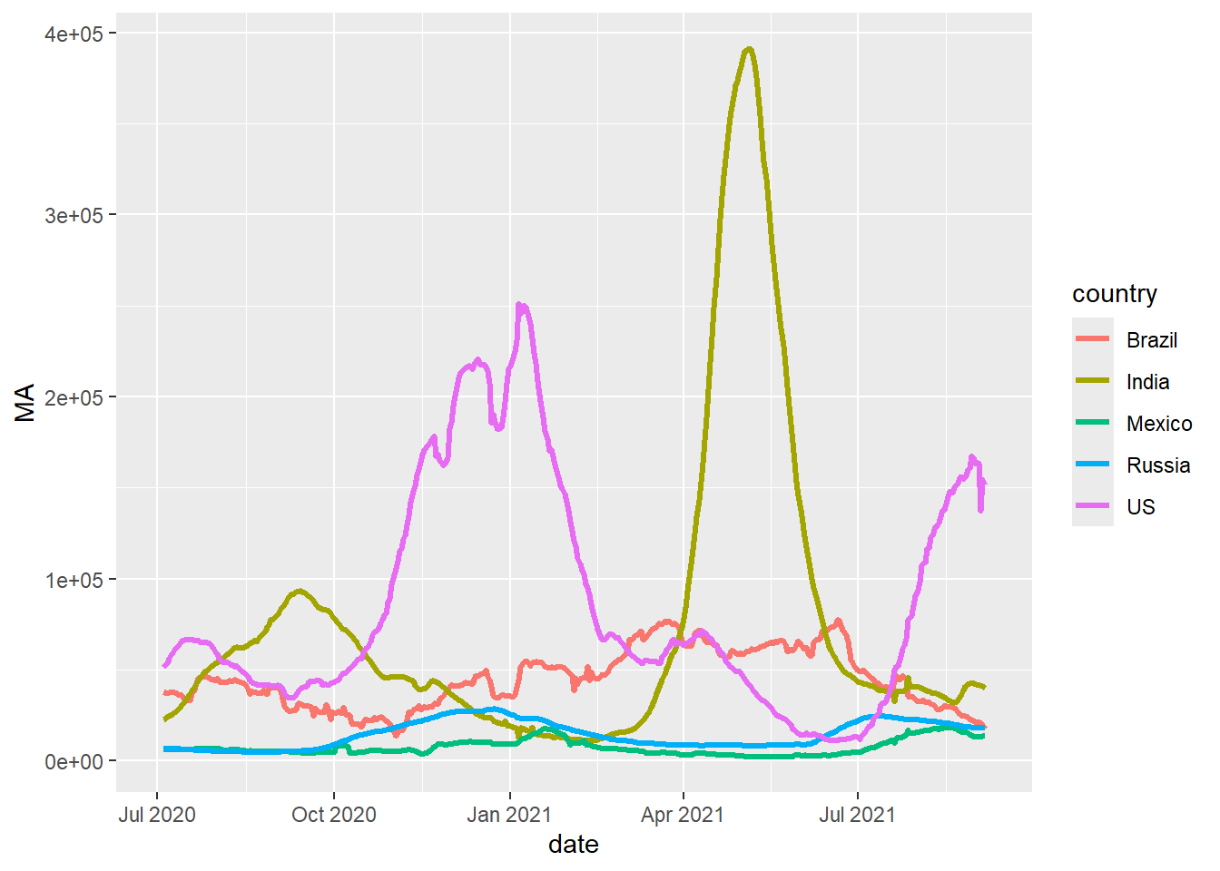
Custom Theme Development
Now let’s build a custom theme on top of those chart functions. Because custom_theme() returns a standard ggplot2 object, it can be applied to any chart type — making it straightforward to keep a consistent look across a report or dashboard.
custom_theme <- function(plt,
                         base_size = 11,
                         base_line_size = 1,
                         palette = "Set1"){

  # Note the use of "+" and not "%>%"
  plt +
    # Adjust overall font size
    theme_minimal(base_size = base_size,
                  base_line_size = base_line_size) +

    # Put legend at the bottom
    theme(legend.position = "bottom") +

    # Different colour scale
    scale_color_brewer(palette = palette)
}

# Test run
line_chart(plotdf, "date", "MA", "country") %>% custom_theme()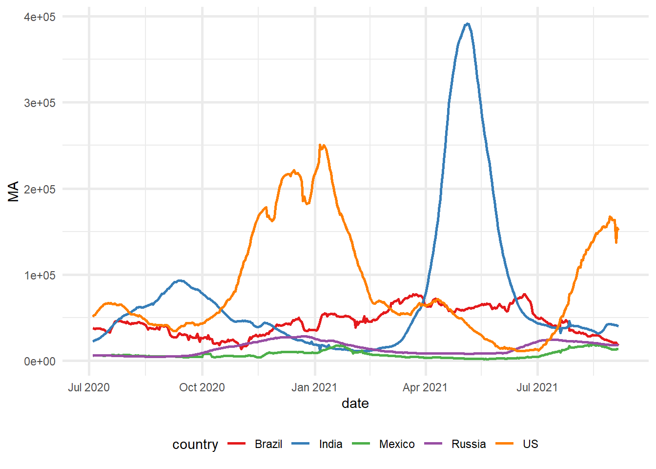
Advanced Function Enhancement
The following section demonstrates the expansion of the line_chart() function to incorporate additional features and parameters, thereby increasing its versatility and applicability across diverse visualization requirements:
line_chart <- function(df,
                       x, y,
                       group_color = NULL,
                       line_width = 1,
                       line_type = 1,
                       xlab = NULL,
                       ylab = NULL,
                       title = NULL,
                       subtitle = NULL,
                       caption = NULL){
  # Base plot
  ggplot(df, aes(x = !! sym(x),
                 y = !! sym(y),
                 color = !! sym(group_color))) +

    # Line chart
    geom_line(size = line_width,
              linetype = line_type) +

    # Titles and subtitles
    labs(x = xlab,
         y = ylab,
         title = title,
         subtitle = subtitle,
         caption = caption)
}
Correspondingly, we enhance the custom_theme() function to accommodate diverse axis formatting options and advanced styling parameters:
custom_theme <- function(plt,
                         palette = "Set1",
                         format_x_axis_as = NULL,
                         format_y_axis_as = NULL,
                         x_axis_scale = 1,
                         y_axis_scale = 1,
                         x_axis_text_size = 10,
                         y_axis_text_size = 10,
                         base_size = 11,
                         base_line_size = 1,
                         x_angle = 45){

  mappings <- names(unlist(plt$mapping))

  p <- plt +

    # Adjust overall font size
    theme_minimal(base_size = base_size,
                  base_line_size = base_line_size) +

    # Put legend at the bottom
    theme(legend.position = "bottom",
          axis.text.x = element_text(angle = x_angle)) +

    # Different colour palette
    {if("colour" %in% mappings) scale_color_brewer(palette = palette)}+

    {if("fill" %in% mappings) scale_fill_brewer(palette = palette)}+

    # Change some theme options
    theme(plot.background = element_rect(fill = "#f7f7f7"),
          plot.subtitle = element_text(face = "italic"),
          axis.title.x = element_text(face = "bold",
                                      size = x_axis_text_size),
          axis.title.y = element_text(face = "bold",
                                      size = y_axis_text_size)) +

    # Change x-axis formatting
    {if(!is.null(format_x_axis_as))
      switch(format_x_axis_as,
             "date" = scale_x_date(breaks = pretty_breaks(n = 12)),
             "number" = scale_x_continuous(labels = number_format(accuracy = 0.1,
                                                                  decimal.mark = ",",
                                                                  scale = x_axis_scale)),
             "percent" = scale_x_continuous(labels = percent))} +

    # Change y-axis formatting
    {if(!is.null(format_y_axis_as))

      switch(format_y_axis_as,
             "date" = scale_y_date(breaks = pretty_breaks(n = 12)),
             "number" = scale_y_continuous(labels = number_format(accuracy = 0.1,
                                                                  decimal.mark = ",",
                                                                  scale = y_axis_scale)),
             "percent" = scale_y_continuous(labels = percent))}

  # Capitalise all names using labs()
  capitalized_labels <- lapply(p$labels, str_to_title)
  p <- p + do.call(labs, capitalized_labels)

  return(p)
}
Integrated Function Implementation
The following demonstration illustrates the coordinated application of our enhanced functions to generate a polished, publication-ready visualization:
line_chart(plotdf,
           x = "date",
           y = "MA",
           group_color = "country",
           xlab = "Date",
           ylab = "Moving Avg. (in '000)",
           title = "Daily COVID19 Case Load",
           subtitle = "Top 5 countries by volume") %>%

  custom_theme(format_x_axis_as = "date",
               format_y_axis_as = "number",
               y_axis_scale = 0.001)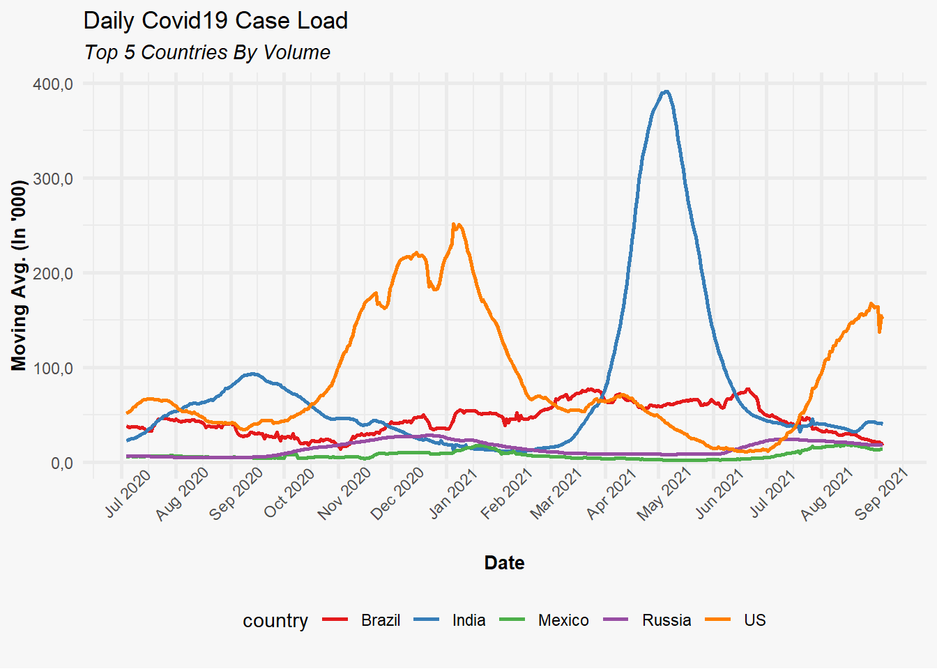
Cross-Chart Type Theme Application
The architectural design of our custom_theme() function enables its universal application to any ggplot2 object, regardless of visualization type. The following example demonstrates this flexibility through bar chart implementation:
p <- plotdf %>%
  mutate(month = format(date, "%m-%b")) %>%
  ggplot(aes(x = month, y = MA, fill = country)) +
  geom_col(position = "dodge") +
  labs(title = "Monthly COVID19 Case load trend",
       subtitle = "Top 5 countries",
       x = "Month",
       y = "Moving Average ('000)")

custom_theme(p,
             palette = "Set2",
             format_y_axis_as = "number",
             y_axis_scale = 0.001)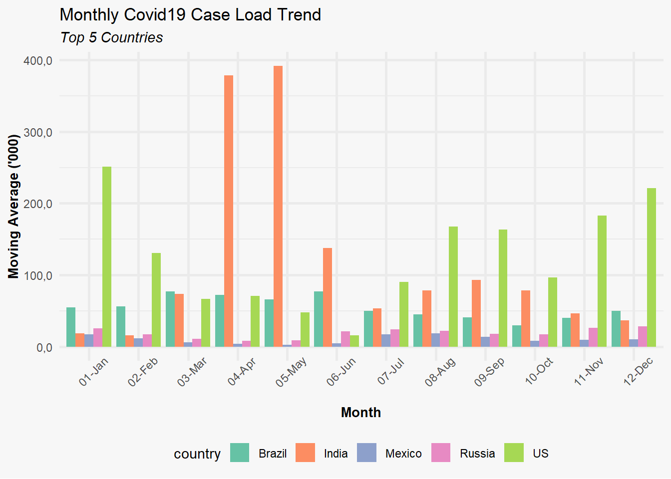
Why use Custom Charting Functions
The development of custom charting functions utilizing ggplot2 provides substantial advantages for analytical workflows:
Visual Consistency: Ensures uniform appearance and styling across all visualizations within reports or analytical dashboards.
Less repetition: Wrapping common chart patterns into a function means less boilerplate code each time you need that chart type.
Maintenance Optimization: Facilitates centralized style updates through single function modifications, propagating changes across all implementations.
Accessibility Enhancement: Abstracts ggplot2 complexity for team members with varying levels of package familiarity, democratizing visualization capabilities.